How to Create Charts on iOS using SwiftUI
Spruce up your app with Apple's built-in Charts library

Software Engineer
SwiftUI Natively Supports Charting
Starting with iOS 16, iPadOS 16, and watchOS 9, SwiftUI supports the native creation of charts. Before those versions were released in 2022, creating a chart required tons of development work or an outside dependency.
Requirements
Creating charts using SwiftUI requires developing an iOS app targeted at iOS 16 and above.

Mark Types
Mark types are used to plot data onto charts. Apple defines six mark types.
AreaMark(x: , y: )LineMark(x: , y: )PointMark(x: , y: )RectangleMark(x: , y: )RuleMark(xStart: , xEnd: , y:)BarMark(x: , y: )
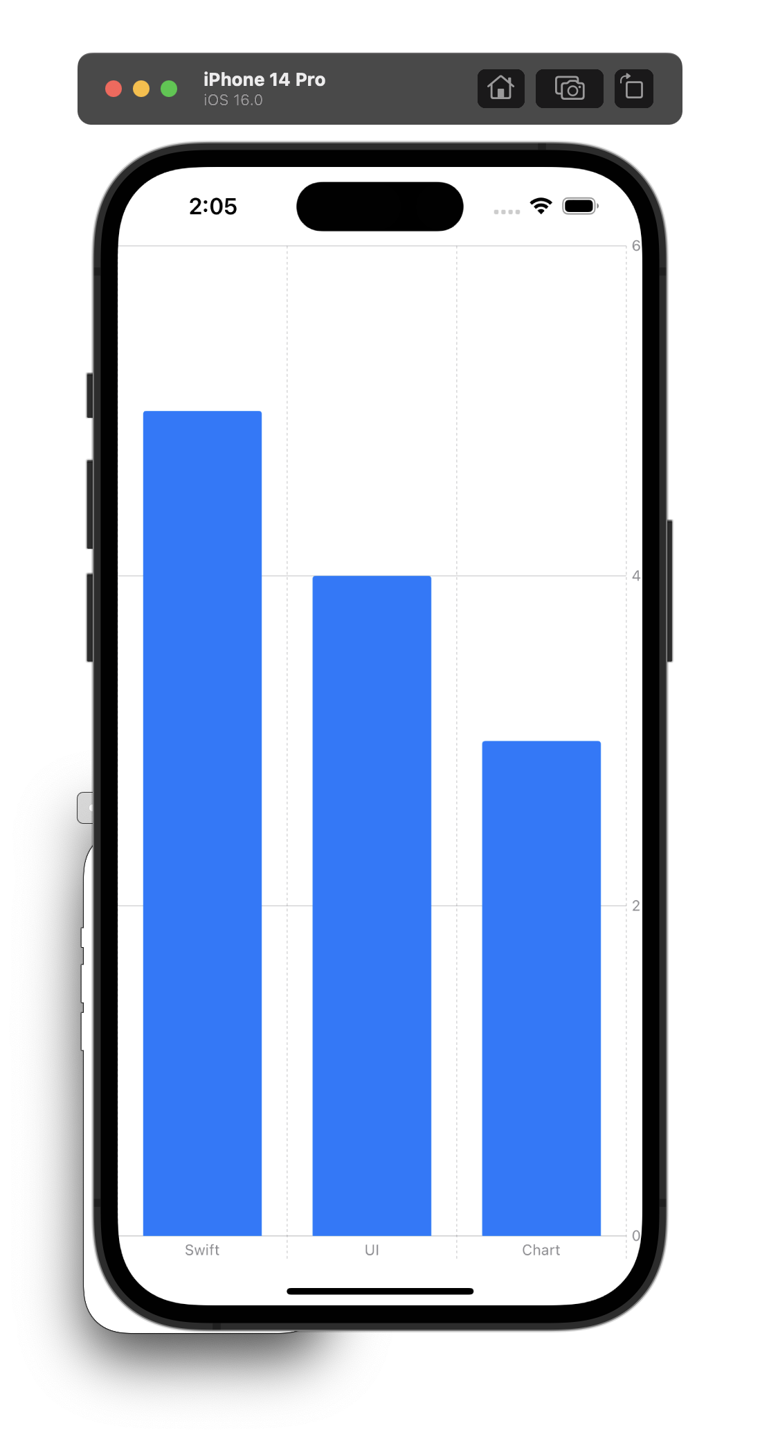
How to Create a Basic Bar Chart
Every chart starts with a Chart view. The Chart view is the container for the data. Inside the Chart view, you can start providing data using one of Apple's predefined marks.
Chart {
    BarMark(
        x: .value("Type", "Swift"),
        y: .value("Total Count", 5)
    )
    BarMark(
        x: .value("Type", "UI"),
        y: .value("Total Count", 4)
    )
    BarMark(
        x: .value("Type", "Chart"),
        y: .value("Total Count", 3)
    )
 }
A more advanced bar graph example can be found over on my Github.

How to Create a Line Graph
A line graph can be created by using LineMark inside a Chart view.
Chart {
    LineMark(
        x: .value("Type", "Swift"),
        y: .value("Total Count", 5)
    )
    LineMark(
        x: .value("Type", "UI"),
        y: .value("Total Count", 4)
    )
    LineMark(
        x: .value("Type", "Chart"),
        y: .value("Total Count", 3)
    )
 }

How to Create a Scatter Plot
Finally, a scatter graph can be created by using PointMark inside a Chart view.
Chart {
    PointMark(
        x: .value("Type", "Swift"),
        y: .value("Total Count", 5)
    )
    PointMark(
        x: .value("Type", "UI"),
        y: .value("Total Count", 4)
    )
    PointMark(
        x: .value("Type", "Chart"),
        y: .value("Total Count", 3)
    )
 }

How to Label Chart Data
- Data can be labeled using a PlottableValue.
PointMark(
    x: .value("Type", "Swift"),
    y: .value("Total Count", 5)
).foregroundStyle(by: .value("Series", "Swift"))
Conclusion
SwiftUI Charts is a powerful and easy-to-use option that brings crucial functionality to native support. Try including it in your next app hacking project.


